Make Outlook 2016 unread messages easier to see
After recently upgrading to Office 2016, one of the first products that I wanted to test drive was Outlook 2016 as email is a crucial part of the day, every day. In general I like Outlook 2016 and some of the new behaviors therein. However, one of the first things I noticed that I didn’t care for was how unread messages looked when they arrived in the inbox. They almost seemed to melt in with the already read messages underneath. At a quick glance, they were not too discernible from the other messages in the inbox.
After playing around a bit with the view settings, making your unread messages stand out quite a bit more is actually an easy thing to do. Let me show you guys what I settled with on my view settings.
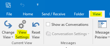
In the Menu ribbon click the View tab, then View Settings:
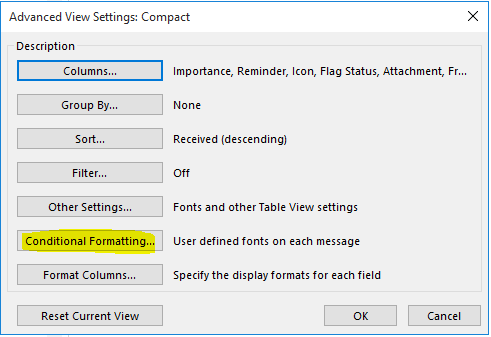
Click the Conditional Formatting button:
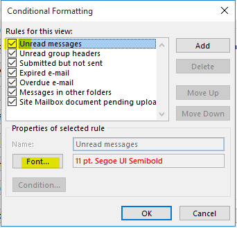
Highlight the Unread Messages in the Rules for this view section and then click the Font button:
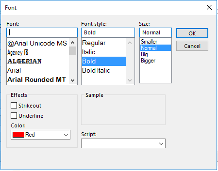
The settings I found to work for me were the following:
- Font Style: Bold
- Size: Normal
- Color: Red
After making this simple change, viewing unread messages in the Outlook 2016 inbox became much easier to distinguish from messages that were already read. Changing the color of the unread messages to Red assured that an unread message would not be missed inadvertently. Hopefully this quick tip will help you guys if you have experienced the same thought or frustration with the default Outlook 2016 view settings. Comment and let me know what other tweaks you have made to your configuration in 2016.




Nice! Extremely helpful. I had the same issue when I just turned on Outlook 2016. I looked at my inbox and had a hard time telling which were read and which were not. This solved that so thanks a bunch.